SRB Data Collection
Background & Study Design
I work at UCSB’s Student Resource Building Front Desk as a student assistant and supervisor. Here, I field a lot of questions from students, staff, and building patrons about things such as the location of services within the building, office supplies, and space reservations within the building. In ENV S 193DS (Statistics for the Environmental Sciences), we were tasked with creating a research question surrounding something that mattered to us, collecting data, and analyzing it throughout the quarter. My core question was determining the most common reason people approach the SRB front desk. I decided to keep track of every time someone approached the desk, along with the week, shift time, and reason among many other variables, which I collected while I worked in a spreadsheet. The below visualizations map my progress through the quarter as I learned R and collected more data.
Data Visualization Timeline
April 24, 2024
Figure 1. This was my first time working with my data. The figure that made the most sense for me to create was a bar chart. In creating this, I was able to learn how to change the colors of my variables! Unfortunately, I was not able to figure out how to order my x-axis, so the shift times were out of order. For the amount of data that I had, a grouped bar chart made sense, but I did later change the figure I was creating.
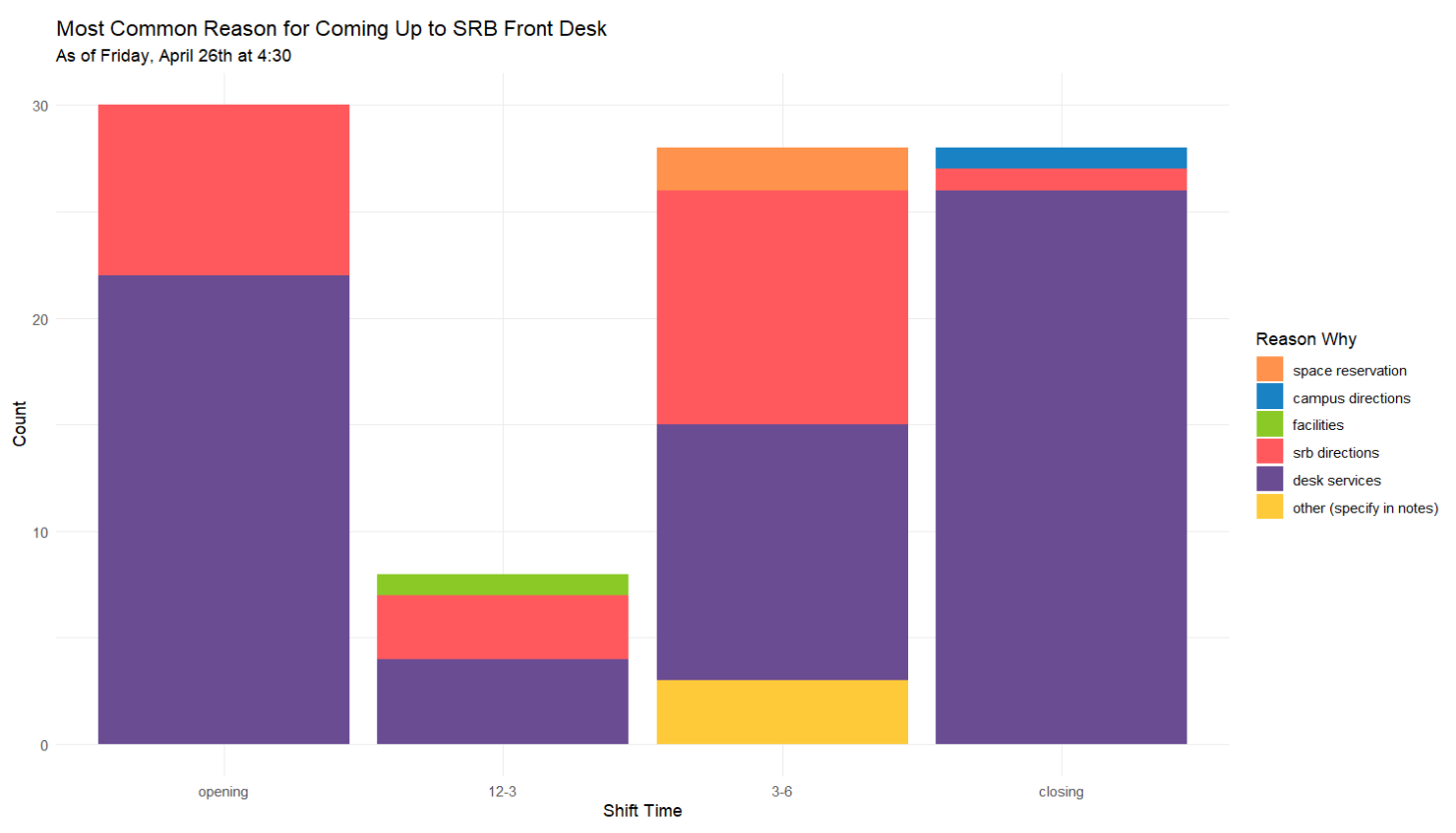
April 26, 2024
Figure 2. This figure was my first venture in displaying my data in a stacked bar chart. Because of the amount of reasons, and shift times, I wanted my figure to be less cluttered, which the grouped bar chart definitely was! I pivoted to a stacked bar chart, but decided against a percentage bar chart to show the count of my observations. I was also able to figure out how to order my x-axis and variables, and changed the color palette. The code I wrote for this visualization stayed relatively the same throughout the rest of my visualizations.
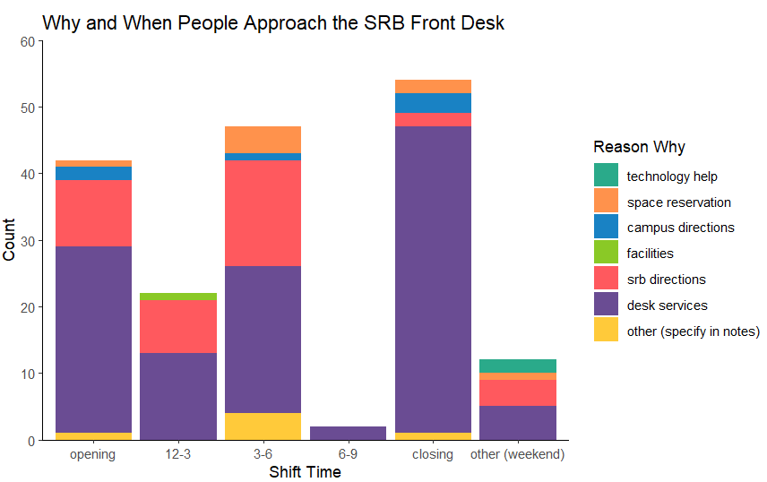
May 8, 2024
Figure 3. The most visible change between this visualization and the last was the addition of observations for the 6-9 and weekend shifts. In order to accommodate these changes, I needed to add more color options and reorder my reasons.
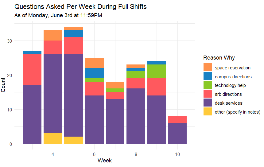
June 3, 2024
Figure 4. This is the most recent visualization of my collected data. The most obvious change is the increase in observations for the 3-6 and closing shifts, which dwarf all other shift times. I explain this discrepancy in the note below. Generally, though, I am very happy with this visualization!
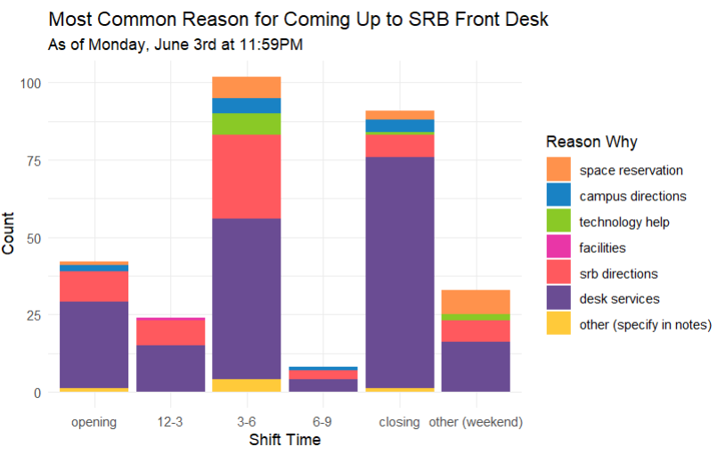
A note on data collection
My data was collected during times I was present at the desk, whether that be visiting or covering or working my regular shifts. As we have fixed schedules throughout the quarter, and I work two closing shifts, and one 3-6 every week, my observations for these time slots are much higher than other shift times. Data from other shift times, like the 12-3 and 6-9, were typically observed when I would visit the desk or arrive early for a shift. I worked around this issue in a few different ways, which are displayed below!
Different Data Visualizations
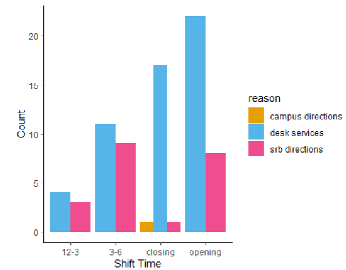
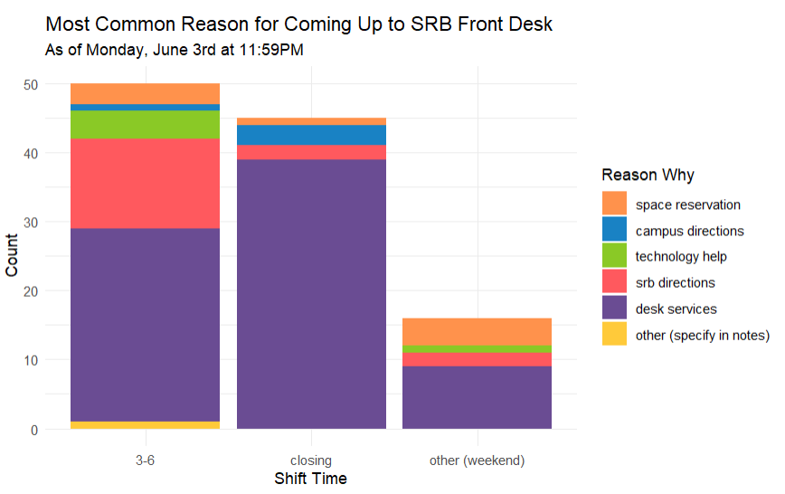
Recurring shifts only
Figure 5. Most common reason for approaching the desk during recurring shifts. This visualization filtered out any observations taken during times I was not scheduled to work at the desk - only keeping Monday and Wednesday closing, and Friday 3-6 observations. This ensures that the times of data collection are the same week to week. The most interesting part of this visualization is that, even though I work more closing shifts per week, more people approach the desk during the 3-6 shift! I also think the difference between people asking for directions within the building during closing and the 3-6 is interesting as well!
Spring quarter timeline
Figure 6. Amount of questions asked throughout spring quarter. This visualization uses week number instead of shift time as the x-axis, and only includes data from my scheduled weekly shifts. This visualization addresses the discrepancy in observations for each shift time, as it only includes data from my recurring shifts each week. My favorite part of this figure is the clear decrease in questions as the quarter progresses. Though my own personal experience, I’ve noticed this trend of students generally figuring things out around week 5 and asking less questions, but having the observations and data to support that claim is really cool! This visualization is definitely my favorite, and the one I’m most proud of!